We match. You grow.
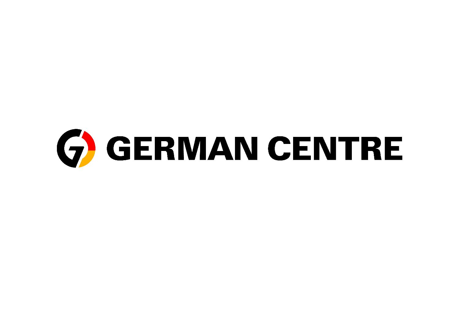
Now it’s out: Our joint German Centre logo!
The new German Centre logo is there! We speak with Dominique Herold, Managing Director of German Centre GmbH and German Centre Singapore, and Ute Papadopoulos, Head of Global Marketing and Communication, German Centre GmbH.

The German Centres in Beijing, Mexico, Shanghai, Taicang and Singapore have one thing in common: They provide an excellent business environment for German companies to succeed in foreign markets. Why shouldn‘t you do this under exactly one logo?
Dominique:
Historically, the German Centre network grew one by one, starting with German Centres Singapore and Shanghai in 1995. And so grew the visual appearance one by one. For the logo, this meant: Although we have a connecting element, the G, we use the location identifier to signal that each German Centre stands for itself. Since the world is constantly growing together and we as the German Centres Worldwide team are growing together with the same passion, we recognized that this should be reflected in one common logo.
The new logo really conveys our enthusiasm and passion in supporting our customers when starting and growing abroad. And that’s a great result!
Dominique Herold
Managing Director German Centre GmbH, Managing Director German Centre Singapore
What are the main changes of the new logo?
Ute:
A main target was to give it significantly more power while retaining its recognition value. And to relate to what makes us special. Firstly, we bring together the best from German companies under one roof. Therefore, we emphasized the colours of the German flag and have included red and gold much more clearly in the circle. Secondly, we have upgraded the circle itself. Because the circle embraces the place where companies succeed in the international arena: Right here at the German Centres. And last, but not least, we deleted the location identifier and now have one joint logo which reflects that every German Centre is the pace to be to start and grow in foreign markets.
Dominique:
What I like about the logo is that it looks much more modern and dynamic. It really conveys our enthusiasm and passion in supporting our customers when starting and growing abroad. And that’s a great result!
Our new logo is the result of a common development process. For us, it was most important to focus on the G-circle which is the place-to-go for companies who want to succeed in the international arena: Right here at the German Centres.
Ute Papadopoulos
Head of Global Marketing&Communication, German Centre GmbH
How much work is behind such a logo evolution?
Ute:
Our new logo is the result of a common development process which included our customers, our employees and also our stakeholders. Our guiding question was: What do these parties valuate at the German Centres? It is the reliability and the dedication of all teams in Beijing, Mexico, Shanghai, Taicang, and Singapore to act as business facilitator for our customers. And it is the matchmaking and networking opportunities which provide a real added value compared to being a tenant in any office building. Together with the marketing managers in all German Centre locations, we put this self-concept into the briefing for the marketing agency. This concept-development process takes place permanently and over months. The actual design process then we finalized in a month. That was quite fast as we knew what we want and a highly professional approach by our marketing agency.
Dominique:
The owner of the logo is German Centre GmbH, a subsidiary of LBBW that operates the German Centres in Beijing, Mexico and Singapore. So, LBBW was included in the development process as well and the German Centres in Beijing, Mexico and Singapore add „Part of LBBW“ into their logo. This emphasizes that LBBW Group accompanies international customers with financial solutions and supports their strategic outreach to markets abroad. I think: a “perfect match”!
Thank you for the inspiring insights, Dominique und Ute!
What our Marketing Managers say about the new logo
Erin Lin Yang, Marketing Manager at German Centre Beijing:
In addition to the dynamic visual impact of our new logo, which reflects the evolution of our brand and services in line with the changing times and needs of our customers, what truly resonates with me is the unified identity it represents for all German Centres. This underscores not only our shared commitments across all locations but also the strength of our global network in serving our customers. Together, we can achieve greater growth, faster.
Abigaile Yu, Marketing Manager at German Centre Singapore:
Our new logo’s fresh, vibrant design embodies our evolution, with the “G” circle symbolizing the all-encompassing support and community we provide. The removal of the location identifier further reinforces our united network, where each German Centre, while unique, shares a common goal: to be the go-to place for German companies looking to grow in foreign markets. This logo isn’t just a symbol; it’s our promise and vision rolled into one.
Anja Miroslaw, Sales and Marketing Manager at German Centre Mexico:
Embracing the new logo of the German Centre is like witnessing the dawn of a new era. Its fresh, clear design radiates strength and leaves a lasting impression, symbolizing not just a physical location, but a thriving community both in Mexico and beyond. After two decades, the timing couldn’t be more perfect for this transformation, as it elevates our brand, making it even more impactful in today’s global economy.
Similar posts
More News and Events
German Centres Worldwide launch new website
A modern look and feel, responsive navigation and lots of new content, such as success stories, a blog and more than 100 customer profiles - our recently relaunched website is more than a facelift.
Digital life in China (part II)
The second part of our "Digital life in China" guide covers transportation, online travel booking, medical services and ideal business meeting venues.


